Overview
Dysfic’s mission is to promote awareness, enlightenment, critical thinking, and positive societal change by hosting a convention for young people who enjoy dystopian fiction.
Process
Taking adjectives from the design brief, I looked for design examples that seemed to emulate dystopian fiction: dark, serious and intriguing.
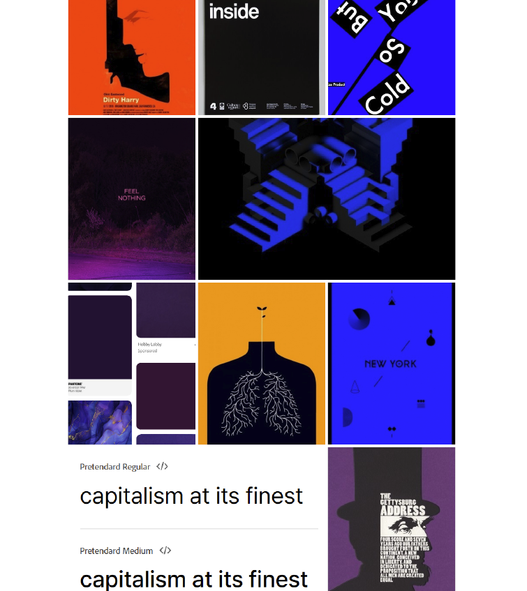
These were then used to create materials for the event brand.
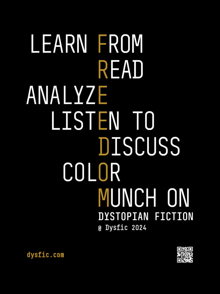
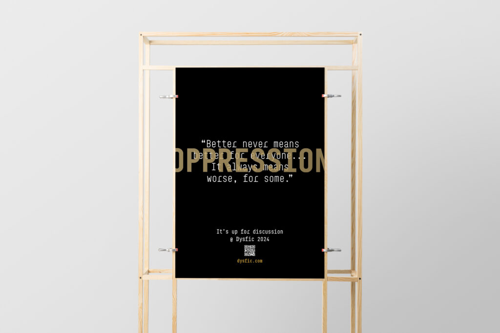
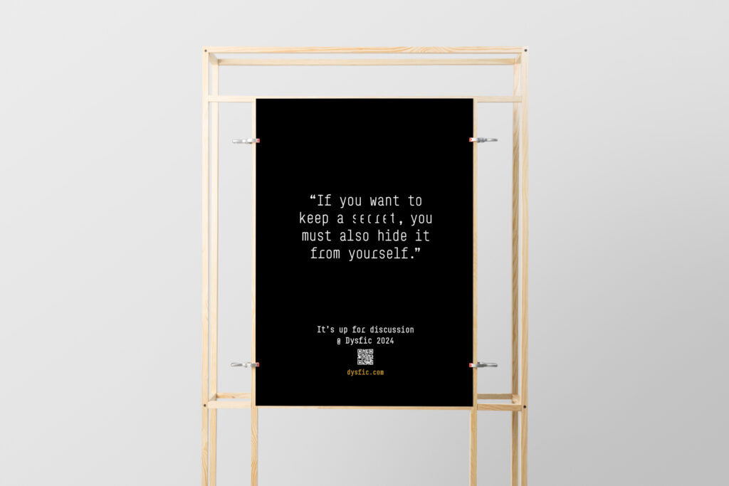
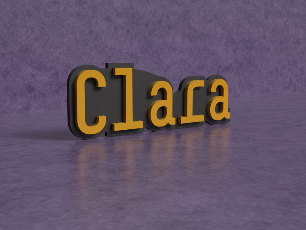
Promotional Poster Series
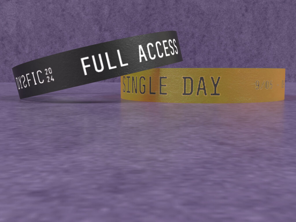
Wristbands
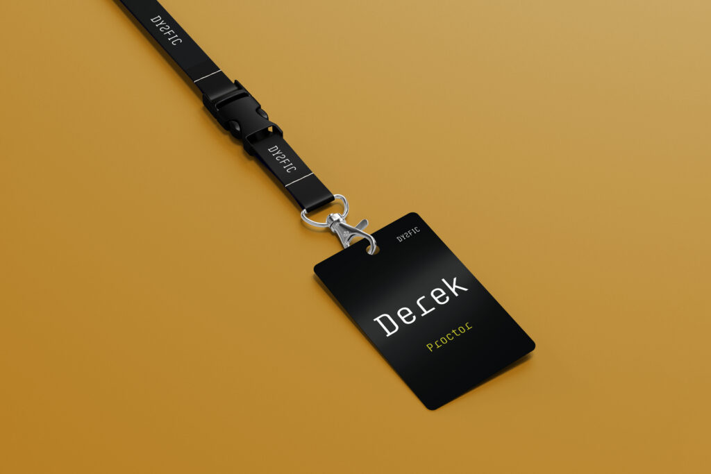
Exhibitor Name Tag
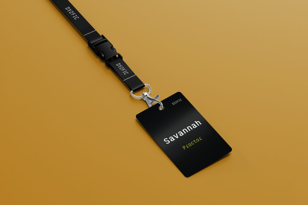
Staff Badges
Design Justification
The use of bright colors on black makes for serious-feeling and intriguing designs.
Challenges
Finding a monospace font to pair with the font used throughout (BC Sklonar) after doing away with the sans-serif font (Pretendard) proved to be very difficult. In the end, this idea was scrapped.